At last I've got some time on my hands to do some painting. I've mentioned earlier that i would present a step by step when creating a color scheme for my Khorne warriors, unless it came out looking like something the cat dragged in. Turned out it came out just like that. Well, not completley.
I actually tried out 2 different approaches on red. I've read that painting red (pun not intended) is a pain to paint and I can't do nothing but agree. It is a pain. This is what I came up with:
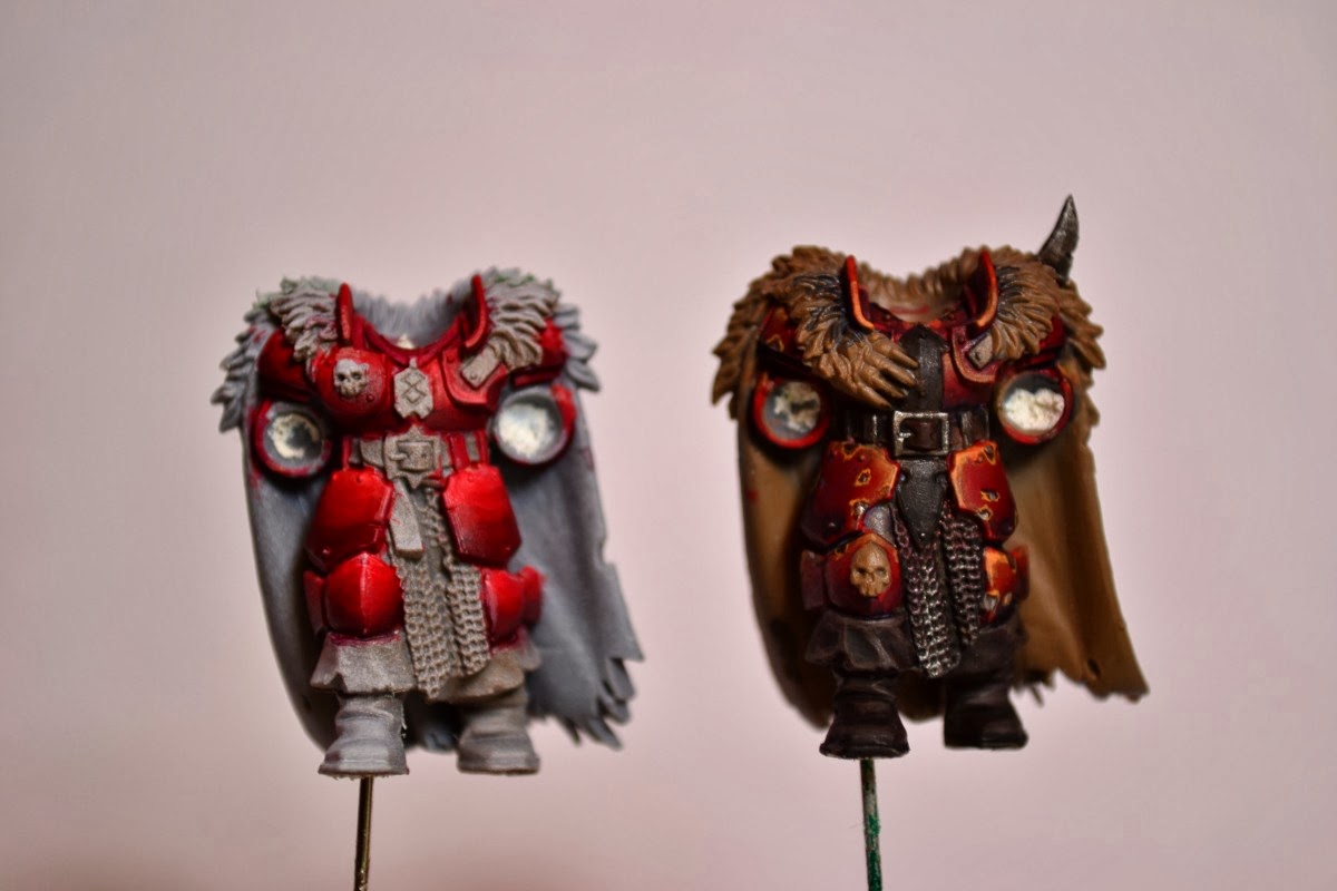
The lef one could have turned out good but I think that I thinned the paint a bit too much or used wrong brush technique since the toning came out quite uneven with lots of streaks. Take a closer look by clicking the picture and you´ll see what I mean. It's also way too bright red. Top side is that it´s good contrast and looks good from afar, but on the other hand pretty much everything looks good at a distance.
Maybe if I mute it down with some blue glaze. Who knows, could take a bit of the streaks away.
I'm more pleased with the right one, It got a more Khorny look but still not exactly what I'm looking for. It don't pop so well from a distance. Maybe change my mind if I see them en masse. What speaks for this color scheme/tone is that it was quick to paint.
I'll give the left style another go tomorrow but going to try to go darker. From black up to bright red but starting with the brighter tones further up and try with thicker paint. This one was about 1:8 paint to water while the right was more like 1:3 ratio. I´m not looking for super smooth but still better than what i achieved here. Practice makes perfect, hopefully.
Minsc of the day:
"My hamster does not like your tone, away with ye!"
No comments:
Post a Comment