Thursday 27 March 2014

Guts 'n Glory: Chaos Lord of Nurgle

Just an little progress update. Actually not much of progress at all. Only bland everyday chores that stops me from doing fun things. 
All work and no play makes Stefan a dull boy.

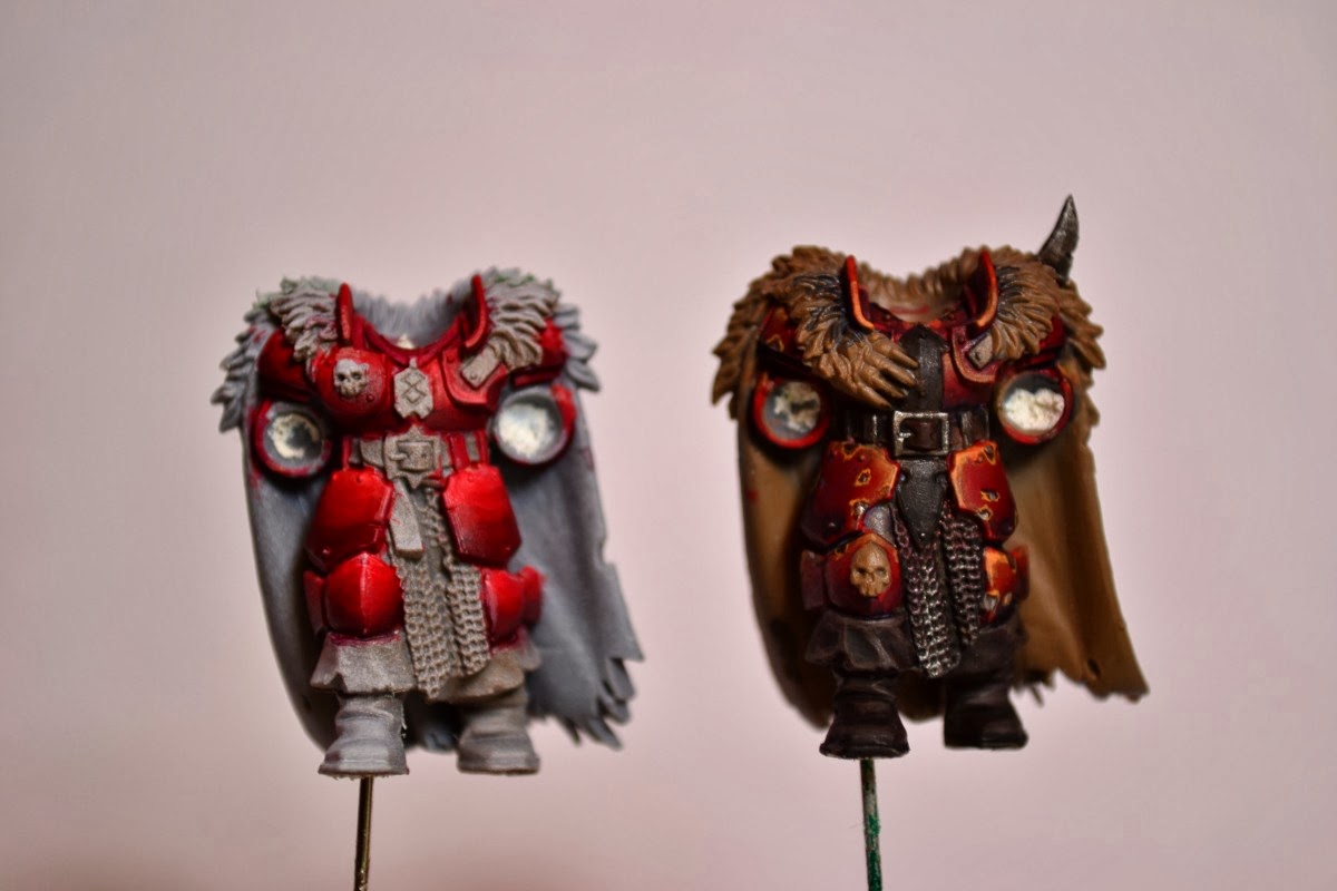
Despite all the boring stuff I rewarded myself with a bit of playtime; that Chaos Lord have been standing on the shelf for way too long time now, tantalizing me to paint him. So thats what I did, he´s gonna get it good!. Not much done yet, only a couple of base layers and a few glazes here and there to catch the overall look. Planning to do my first stumbling attempts of NMM on the axe since it´s quite a big piece that shouldn´t be too difficult. At least I hope so.

It´s not a very clean paintjob so far but i should be able to make it a bit smoother with a bit of work. Only put about 45 minutes on him so far, mostly trying different purples on his stomach. But I´ll get there eventually. He really is a delight to paint, lots of little details (or infections). No wonder that he got so much exposure, it´s an awesome model.
Here he is:


Think I´ll give him a rest for a while now so i can grab myself in the collar and finish the cannon fodder (Marauders) They´ve been gathering dust for too long now.

Tuesday 18 March 2014

Pimp my Warrior


Long time no see.
Back at the paint rack at last. Been busy with work and rereation the past weeks. Took a ski tour to a cabin in the woods for some table rpg with old time friends and it was a blast. Lots of shenanigans for 3 days.

Anyway. While in the woods I loitered on ebay for a while and found some cheap Warhammer stuff for my Warriors of Chaos (or Marauders) and today they came to my mailbox. Bring out ze heads!:


Yep, Space Wolves Heads. Most of them are going to look good on my minis, not sure about the one with the helipad/flat top haircut. Looks bit too posh for a frothing maniac, but I can put him in the middle ranks just to get some extra diversity. There´s also some hi-tech armor plates on the back of the head, but thats not a problem, at least not on the Warriors since the fur trimming on the cloaks will hide them from view. Also got three helmeted heads that´s going into the bitbox of oblivion. I´ve got no plans whatsoever of turning to the dark side (40k).

Now over to another topic. I feel quite certain about which paintscheme to go for with my warriors now. Wrote about them in my previous post- The internet is for Khorne and I´m going for the dark red theme so the ever elusive step by step will be here in a near future.

Thats all!

Wednesday 5 March 2014

The internet is for Khorne

At last I've got some time on my hands to do some painting. I've mentioned earlier that i would present a step by step when creating a color scheme for my Khorne warriors, unless it came out looking like something the cat dragged in. Turned out it came out just like that. Well, not completley.

I actually tried out 2 different approaches on red. I've read that painting red (pun not intended) is a pain to paint and I can't do nothing but agree. It is a pain. This is what I came up with:


The lef one could have turned out good but I think that I thinned the paint a bit too much or used wrong brush technique since the toning came out quite uneven with lots of streaks. Take a closer look by clicking the picture and you´ll see what I mean. It's also way too bright red. Top side is that it´s good contrast and looks good from afar, but on the other hand pretty much everything looks good at a distance.
Maybe if I mute it down with some blue glaze. Who knows, could take a bit of the streaks away.

I'm more pleased with the right one, It got a more Khorny look but still not exactly what I'm looking for. It don't pop so well from a distance. Maybe change my mind if I see them en masse. What speaks for this color scheme/tone is that it was quick to paint.

I'll give the left style another go tomorrow but going to try to go darker. From black up to bright red but starting with the brighter tones further up and try with thicker paint. This one was about 1:8 paint to water while the right was more like 1:3 ratio. I´m not looking for super smooth but still better than what i achieved here. Practice makes perfect, hopefully.

Minsc of the day:
"My hamster does not like your tone, away with ye!"